
PRINT DESIGN
The print design page you're about to witness consists of the different designs that would show how our final posters, magazines and other task would look like at a finished state. The structure and annotation of different other existing posters, influencing our style and choice.
. EXISTING HORROR POSTERS .

For this existing horror poster, what we liked is the costume that the antagonist is dressed in. He is wearing a suit covered in blood, which connotes the authority and power he has over the protagonist in the horror movie. it also depicts class and how most times the evil ones are in high positions without people knowing its them. This can be related to the mid shot of just the costume itself, leaving the the full details of who the antagonist might be, creating suspense and tension.
Another aspect of the poster we liked, is the tag line on the mug, " World's best boss". The cup being white represents the innocent workers blood that is spilled to make his cup full. Its connotes that in the antagonist world, he is the boss and you are the victim, and death is only doors away. |

From this poster, we all liked the use of the lighting. This makes the main character to look more disturbing to the audience. It shows more detail of the characters costume while concealing her details.
Furthermore, the antagonist is holding a knife as a prop to look intimidating and fearful as shown in the reflection on the knife. This connotes that, the film would fall under a slasher sub genre of the horror genre, because knives ans weapons are mostly used in this genre. |

what took our attention from this poster is the way the main character is positioned. The main image is placed up-side down, which connotes vulnerability and being helpless. This is a strong part of the Mise- en- scéne because it shows the audience what the character is going through due to the set design and placement of the character itself.
Also the facial expression depicts that the main character on the poster is distressed and is traumatised. it gives the reader and audience a sense of pity, letting them know that she is in danger. |

For this poster, what we liked is the costume and make up. As shown in the poster, the zombies are dressed up in tattered clothes, bloody faces, broken teeth and so on. This is visually engaging and captivates the reader/audience. It also depicts the bloody scenes embedded in the movie itself, letting the audience know beforehand.
|

What took our attention in this poster is the lighting. the mixture of dark colours such as red, black and bright colours such as white connotes that, there is an element of hope for the antagonist to survive and stock characters as well as death.
Another aspect that took our attention is the prop used. The protagonist are carrying a deadly axe. this also connotes that it is a gorry film as the title says. |

In this poster, what took our attention is the the prop
(matchete). The matchete connotes danger and can be used to display violence and gorr. This represents how powerful the protagonist is and the superior position he hold over the antagonist. Also, the setting of the teenagers in the woods connotes danger and loneliness. This is often used in the horror genre as is depicts the vulnerability of the teens to the protagonist. |
.POSTER DRAWN DRAFTS.

|

|
|
For our first film drawn poster, we took a mid shot of the main character, Ed Morte from behind looking at the mirror. The idea is to create an unknown face/picture with his own reflection to add an element of beauty from the victim, shown in the mirror. a mid shot was also taken of the victim in the mirror.
We also used the mirror , being the main prop to depict the "VANITY" , which is the title and concept of the trailer. 
|
For our second film drawn poster, a close up shot is taken of the antagonist. These reveals his features, depicted as ugly in a broken mirror. We implemented the broken mirror onto the antagonist face to show the motive behind changing peoples look and taking their features to modify his own personal look.

|
|
For our third film drawn poster, there is a two shot of both the antagonist and the victim. This type of shot depicts the vulnerability of the victim. The head of victim is lying on the floor, due to the changes and features made to suit the antagonist.
|
For our last film drawn poster the NVC
(non verbal communication) of the antagonist shows that he is in desperate need to change his features which connotes low self esteem. Also a mid shot is used to depict the reflection of the antagonist. |
.POSTERS-DIGITAL DRAFTS .

|

|

|

|
|
Creating the digital draft for our film posters was very fundamental. This helped by giving a step to step procedure in producing our final products. This task did not really take much time as i have done something similar to this in our first year. it was a case of bringing past knowledge to practicality and i sued adobe Photoshop to create the digital drafts.
|
|
.EXISTING HORROR MAGAZINES.

we choose this magazine because we liked the mixture of different colours to form their colour scheme. Orange, red, yellow and white were all incorporated, making it look unique.

From this scream horror magazine, the main character is the eye catching element, that draws the attention of the audience. The prop used also connotes the type of horror it is, which can be said to be a slasher sub genre.
|

From our second scream magazine, the costume and make up is a significant aspect of the magazine because it brings the horrific look to reality, with the needles been placed in the characters face.

For this scream magazine, we liked the blending of different horror images to make a theme "community". we also liked the font the masthead "scream" is written in.
|

This horror hound horror magazine, has been structured out very well. The layout consist of different characters who are connoted are distressed and helpless in smaller grids. The colour scheme also blends and works well with the main characters appearance.

For our final horror magazine, we chose this because we liked the layout of the coverlines and where the additional pictures are placed. we also liked the white and red colour scheme that is used.
|
.MAGAZINE DRAWN DRAFTS.

For our first magazine drawn draft, i placed three boxes to show where the cover lines of the magazine would go. These cover lines would give the audience an overview idea of the magazine in general. The main character would be placed at the left hand corner of the magazine, experimenting different views and layouts.
|

Our second magazine drawn drafts includes, cover lines at the corner of the page, a puff that will show the issue number of the magazine, the selling line above at the top of the page to entice the reader and the title in a much lager text and font.
|

This third magazine drawn draft consist of similar contents such as the cover lines which are placed in different parts of the front page, an image on the right corner and the title in bold at the top of the page.
|

Out final and last drawn draft, i like the structure and layout this page because it has a lot of content in it. this included the selling line at the top, the cover lines to give brief details
|
. MAGAZINES-DIGITAL DRAFTS .

|

|

|

|
|
As well as creating the digital draft for our film posters, i also had to create digital drafts for the magazines.
An important task that involved me taking my drawn drafts and using adobe Photoshop to make a digital version. |
|
. FINAL POSTER LAYOUTS.
For our final poster layout,this task included the different stages of developing our final piece. The first stage created was just to get an idea of where the title and and the different names go.This was preceded by the next layout, which had the title, names, production blurb such as the cast and directors and logos.
POSTER LAYOUT STAGES.


|


|


|

After experimenting and placing the text typography all around, we finally decided on the two positions we think its best for our final poster. we liked this because the title is at the top and its the first thing the audiences see.
|

For our second final poster illustration,we picked this one because the space between the tagline and title would accommodate the main image which would be catch the attention of the audience.
|
.FINAL MAGAZINE LAYOUTS.
Similar to our final poster layouts, we also had to create different stages and layout to form our final magazine piece. This involved experimenting of different angles with pictures, texts and the title itself.
magazine layout stages


|


|


|

We chose this magazine as our two finals because, the cover lines, title, bar code and other features are appropriately placed and are not masking any other features on the magazine.
|

Similar to the other final chosen magazine, we chose this second magazine because we were able to get as much front page information without loosing any other aspects or conventions.
|
.TEST SHOTS.
As a group,we had to take different test shots for our final poster drafts. This included shots of the antagonist wearing a mask to indicate the ugliness of his face. The different types of shots included close ups, high angle shots and mid shots.

|

|

|

|

We liked this photo because, the Nvc (Non verbal communication) of the protagonist connotes helplessness, when she looks up for help from above.
|

we also liked this photo because, the antagonist here is in possession of a deadly weapon which depicts power and being control over the situation.
|

we liked this photo because the prop used "mirror" depicts the title of our horror research "Vanity".
|

|

|

|

|

We dislike this photo because, the protagonist non verbal communication connotes happiness which subverts the situation she is in, as she is meant to be in pain.
|

we dislike this photo because, audiences are able to see fingers in the background which is not of industry standard.
|

Finally, we dislike this photo because of the lighting. although we can see some features of the antagonist, the low lighting keeps the detail from the audiences.
|
.TEST SHOT & FINAL LAYOUTS.
After we took different pictures from our test shoots, we experimented on the images and placed the poster texts at different positions and angles to see what looks best for the final poster. Here are examples of what the outcome looks like at different positions for our poster.


|


|


|

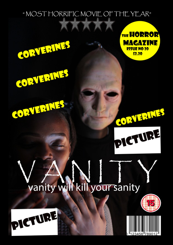
For our final poster draft, we chose this poster because the arrangement of the typography and image allows the audience to flow and understand the theme of "obsession" . we also adjusted the poster to meet an industry standard poster.
|
For our final magazine draft, we chose this magazine because we like the Non verbal communication of the protagonist. her Nvc connotes hopelessness as she is at the point of death. we also like the layout of the cover lines and title.
|
