
TEXTUAL ANALYSIS
The chronicle Pictures team have selected a few existing horror posters, magazines and trailers so that we could annotate them to see if we find any constant and key elements within horror mediums. This will help guide us when building our own products so we know the correct conventions to follow.
HORROR FILM POSTERS
|
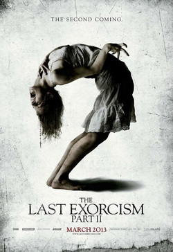
Film Title; The Last Exorcism Part 2
Release Date; March 1st 2013 Director; Ed Gass-Donnelly Production/Financing Company; Studio Canal, Strike Entertainment & Arcade Pictures Principle Cast; Ashley Bell, Julia Garner, Spencer Treat Clark & David Jenson Films Origin/Info; Sequel to 2010's The Last Exorcism Synopsis; Found terrified and alone in rural Louisiana, Nell Sweetzer (Ashley Bell) is now safely in New Orleans. She can't remember the terrible events of the previous months, only that she is the only surviving member of her family. Nell wants to start a new life for herself, but just as she begins the difficult process, the evil force that once possessed her returns bringing with it unimaginably horrific plans that mean her last exorcism was just the beginning. Sub-Genre; Psychological/Supernatural |
Denotation
A long shot of the antagonist is represented to emphasize the characters body language and facial expression. The characters body is positioned in a bent, unnatural way to represent it being possessed which links well with the title of the film basically meaning an exorcism may need to happen. The way the characters hand Is positioned one on her neck and the other one her fingers look crooked this may connote something evil or a demonic spirit may be affecting her and makes her act in a evil way, hurting people around her. The use of the colour white in this film poster may be represented as a bright light or a religious spirit trying to contain or destroy the demonic spirit within the character. Especially as the character is presented as screaming and grabbing her neck this may also connote that the bright light is trying to destroy it however the demonic spirit just wont seem to go especially as its the second coming as stated in the tag-line.
A long shot of the antagonist is represented to emphasize the characters body language and facial expression. The characters body is positioned in a bent, unnatural way to represent it being possessed which links well with the title of the film basically meaning an exorcism may need to happen. The way the characters hand Is positioned one on her neck and the other one her fingers look crooked this may connote something evil or a demonic spirit may be affecting her and makes her act in a evil way, hurting people around her. The use of the colour white in this film poster may be represented as a bright light or a religious spirit trying to contain or destroy the demonic spirit within the character. Especially as the character is presented as screaming and grabbing her neck this may also connote that the bright light is trying to destroy it however the demonic spirit just wont seem to go especially as its the second coming as stated in the tag-line.
Mise-En-Scene
The character in the film poster is wearing a white coloured dress, the colour white connotes purity and innocence which may represent how the main character really is like seeing as she's represented to be a young girl. In relation to horror this is a common thing as it emphasizes the fact that the young girls are innocent but they eventually lose touch with themselves as they become in contact with a supernatural or demonic presence. The setting in this film poster is just a white background and the lighting is quite high key this may emphasize the fact of the character being innocent and pure however around the white background there are parts of dark low key lighting around this may signify a dark presence or demonic spirit lurking around or finding its way to the main character. The main characters body is positioned in an unnatural position which may connote a demonic spirit is within her and taking over her body.
The character in the film poster is wearing a white coloured dress, the colour white connotes purity and innocence which may represent how the main character really is like seeing as she's represented to be a young girl. In relation to horror this is a common thing as it emphasizes the fact that the young girls are innocent but they eventually lose touch with themselves as they become in contact with a supernatural or demonic presence. The setting in this film poster is just a white background and the lighting is quite high key this may emphasize the fact of the character being innocent and pure however around the white background there are parts of dark low key lighting around this may signify a dark presence or demonic spirit lurking around or finding its way to the main character. The main characters body is positioned in an unnatural position which may connote a demonic spirit is within her and taking over her body.
Typography
The title on this film poster is written in serif font and is positioned near the bottom of the film poster this may connote its not the main thing on the poster. The sizes of the text on the poster differentiate for the different type of things for example the size of the "the" in the title is quite small compared to the "Last Exorcism" this may signify that the 'last exorcism" should be the audiences main focus other than the main image of the main character. The sizes of the different text differentiate from big to small this may signify their importance on the film poster, the larger the text the more important it is on the poster. The colour red is used for the date line which makes it stand out to emphasize to the audience when the date is and to maybe also represent that their maybe death involved in this film as the colour red connotes death and anger.
The title on this film poster is written in serif font and is positioned near the bottom of the film poster this may connote its not the main thing on the poster. The sizes of the text on the poster differentiate for the different type of things for example the size of the "the" in the title is quite small compared to the "Last Exorcism" this may signify that the 'last exorcism" should be the audiences main focus other than the main image of the main character. The sizes of the different text differentiate from big to small this may signify their importance on the film poster, the larger the text the more important it is on the poster. The colour red is used for the date line which makes it stand out to emphasize to the audience when the date is and to maybe also represent that their maybe death involved in this film as the colour red connotes death and anger.
Target Audience
The target audience for this film would be teenagers and adults especially as its a sequel to the 2010's The Last Exorcism.
The target audience for this film would be teenagers and adults especially as its a sequel to the 2010's The Last Exorcism.
|
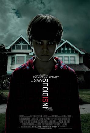
Film Title; Insidious
Release Date; April 1st 2011 Director: James Wan Production/ Financing Company; IM Global, Stage 6 Films & Blumhouse Productions Principle Cast: Patrick Wilson, Rose Byrne & Barbra Hershey Films Origin/Info: Franchise Synopsis: It is the first installment in the insidious film series. The story centers on a couple whose son inexplicably enters a comatose state and becomes a vessel for ghosts in an astral dimension who want to inhabit his body, in order to once again live Sub-Genre; Psychological/ Supernatural |
Denotation
The film poster uses a mid shot of the main character looking directly towards the camera lens, focusing all his attention on the audience giving them direct eye contact, making him be represented as being very serious this may connote something bad may or will happen to him during the film. The poster follows the main conventions of a supernatural horror due to its use of a young male, with his eyes scratched out. This signifies to the audience that he may be either the protagonist or antagonist. The use of having 'from the makers of paranormal activity and saw' films that have been proven to be quite successful, gives insidious an immediate reputation for audience to actually watch the film. The use of a mid shot connotes dominance as well as importance suggesting the main image is the most important thing on this film poster.
The film poster uses a mid shot of the main character looking directly towards the camera lens, focusing all his attention on the audience giving them direct eye contact, making him be represented as being very serious this may connote something bad may or will happen to him during the film. The poster follows the main conventions of a supernatural horror due to its use of a young male, with his eyes scratched out. This signifies to the audience that he may be either the protagonist or antagonist. The use of having 'from the makers of paranormal activity and saw' films that have been proven to be quite successful, gives insidious an immediate reputation for audience to actually watch the film. The use of a mid shot connotes dominance as well as importance suggesting the main image is the most important thing on this film poster.
Mise-En-Scene
The main characters costume is represented as him being in his pyjamas and his shoulders are relaxed almost as if he's asleep or without control of his body connoting the purpose of his role in the film, suggesting he may either be in a deep sleep, a coma, or something they have no idea what it is. Furthermore with the image showing the setting of the film in the background, being dark, old and creepy is a common location for psychological/ supernatural horror films to occur in. Low key lighting is used in this film poster to connote the dark spirit that may be lingering around the main character and his house which is the setting of the film and is currently behind him
The main characters costume is represented as him being in his pyjamas and his shoulders are relaxed almost as if he's asleep or without control of his body connoting the purpose of his role in the film, suggesting he may either be in a deep sleep, a coma, or something they have no idea what it is. Furthermore with the image showing the setting of the film in the background, being dark, old and creepy is a common location for psychological/ supernatural horror films to occur in. Low key lighting is used in this film poster to connote the dark spirit that may be lingering around the main character and his house which is the setting of the film and is currently behind him
Typography
The title of this film poster is written in bold sans serif font and is positioned landscape. As its positioned in a weird different way this may represent that something unusual may occur in the film. The colour of the title is white and red, the white may connote innocence for the little boy and red may connote anger or death. suggesting something important or bad may happen to the main character. The mood of this film poster is quite dark and dull especially as there are grey clouds represented in the poster, connoting a gloomy mood.
The title of this film poster is written in bold sans serif font and is positioned landscape. As its positioned in a weird different way this may represent that something unusual may occur in the film. The colour of the title is white and red, the white may connote innocence for the little boy and red may connote anger or death. suggesting something important or bad may happen to the main character. The mood of this film poster is quite dark and dull especially as there are grey clouds represented in the poster, connoting a gloomy mood.
Target Audience
The target audience for this film would be teenagers and adults who enjoy supernatural/psychological horror films.
The target audience for this film would be teenagers and adults who enjoy supernatural/psychological horror films.

|
Film Title; Poltergeist
Release Date; May 22nd 2015 Director; Gil Kenan Production/Financing Company; Ghost House Pictures, TSG Entertainment, Vertigo Entertainment & Metro-Goldwyn-Mayer Principle Cast; Sam Rockwell, Rosemarie Dewitt, Jared Harris & Jane Adams Films Origin/Info; A remake of the 1982 Poltergeist Film Synopsis; All seems well for Eric Bowen (Sam Rockwell), wife Amy (Rosemarie DeWitt) and their three children as they move into their new house in the suburbs of Illinois. Soon, youngest daughter Maddy (Kennedi Clements) begins talking to an imaginary friend, or so the family thinks. It's not long before sinister spirits wreak havoc in the home, holding Maddy captive and forcing the parents to consult a team of parapsychologists who engage the supernatural entities in a battle for the girl's freedom. Sub-Genre; Psychological/ Supernatural |
Denotation
A mid shot of the antagonist which is a clown is clearly presented on the film poster, this may connote or foreshadow what may happen in the film such as things we love or are friendly may turn out to be evil or cause the death of you, in this case clowns are supposed to friendly however in this film poster the clown has a scary look to it which may emphasize the fact that he's not who he's supposed to be and he maybe the death of characters, it may also connote he has a possessed spirit which may take over others such as his smile or him being a clown draws you in to him. The colour red is used consistently on the clown which may connote death and anger. Also the colour red is mainly used for the film genre horror as it represents the blood that has been gathered from the characters that have been killed. In this film poster the main image of the antagonist dominates the page this may connote he is the most important character in the film and film poster, it may also represent his role in the film which is he is a very important character.
A mid shot of the antagonist which is a clown is clearly presented on the film poster, this may connote or foreshadow what may happen in the film such as things we love or are friendly may turn out to be evil or cause the death of you, in this case clowns are supposed to friendly however in this film poster the clown has a scary look to it which may emphasize the fact that he's not who he's supposed to be and he maybe the death of characters, it may also connote he has a possessed spirit which may take over others such as his smile or him being a clown draws you in to him. The colour red is used consistently on the clown which may connote death and anger. Also the colour red is mainly used for the film genre horror as it represents the blood that has been gathered from the characters that have been killed. In this film poster the main image of the antagonist dominates the page this may connote he is the most important character in the film and film poster, it may also represent his role in the film which is he is a very important character.
Mise-En-Scene
The lighting of this film poster is quite low key and dark which connotes the dark, shadowy theme of the movie it also emphasises the dark spirit which may be lingering around the characters, seeing as on the left hand side of the film poster its quite light but as you move along to the right hand side, the lighting becomes quite dim and dull. Around the area of the antagonists face there is high key lighting presented to emphasise the antagonists facial expression. As the high key lighting and low key lighting merge together this may represent or foreshadow what may eventually occur in the film such as good and evil characters especially as the antagonist is a clown this may connote he is friendly but evil, kind of like a deception especially as his facial expression and make-up look quite scary. As the film poster mainly has low key lighting your not able too see the setting probably this connotes a type of fear of the unknown, your not able to see where the antagonist is, you basically don't have an background idea of where he may be. It may also connote suspense and tension as you have no idea or clue who or what is in the background this again emphasizes the fact of fear of the unknown.
The lighting of this film poster is quite low key and dark which connotes the dark, shadowy theme of the movie it also emphasises the dark spirit which may be lingering around the characters, seeing as on the left hand side of the film poster its quite light but as you move along to the right hand side, the lighting becomes quite dim and dull. Around the area of the antagonists face there is high key lighting presented to emphasise the antagonists facial expression. As the high key lighting and low key lighting merge together this may represent or foreshadow what may eventually occur in the film such as good and evil characters especially as the antagonist is a clown this may connote he is friendly but evil, kind of like a deception especially as his facial expression and make-up look quite scary. As the film poster mainly has low key lighting your not able too see the setting probably this connotes a type of fear of the unknown, your not able to see where the antagonist is, you basically don't have an background idea of where he may be. It may also connote suspense and tension as you have no idea or clue who or what is in the background this again emphasizes the fact of fear of the unknown.
Typography
The title on this film poster has been written in bold sans serif font and is in white. The colour white may connote innocence which may be represented with the protagonist character or a character who may be a child. The colour of the title contrasts well with the low key lighting and the unsettling mood of the film poster. The way the date line is positioned in the centre at the bottom on top of the credits may represent that its the third most important thing on the film poster after the film title as it blocks parts of the credits and its in red which makes it stand out at the bottom of the page. This makes it easier for the audience to know when the release date is. The use of the tagline '#whatareyouafraidof' connects well with the main image of the clown as most people would be afraid of clowns.
The title on this film poster has been written in bold sans serif font and is in white. The colour white may connote innocence which may be represented with the protagonist character or a character who may be a child. The colour of the title contrasts well with the low key lighting and the unsettling mood of the film poster. The way the date line is positioned in the centre at the bottom on top of the credits may represent that its the third most important thing on the film poster after the film title as it blocks parts of the credits and its in red which makes it stand out at the bottom of the page. This makes it easier for the audience to know when the release date is. The use of the tagline '#whatareyouafraidof' connects well with the main image of the clown as most people would be afraid of clowns.
Target Audience
The target audience for this film would be teenagers and adults especially as it has a clown as the main image teenagers would be drawn to that mostly, however because this film is a remake of the 1982 poltergeist film older adults would want to watch it too.
The target audience for this film would be teenagers and adults especially as it has a clown as the main image teenagers would be drawn to that mostly, however because this film is a remake of the 1982 poltergeist film older adults would want to watch it too.
HORROR FILM MAGAZINE

|
Film Title; Scream 4 (Scream)
Release Date; April 15th 2011 Director; Wes Craven Production/Financing Company; Dimension Films, Outerbanks Entertainment & Corvas Corax Productions Principle Cast; Courteney Cox, Emma Roberts, David Arquette & Neve Campbell Films Origin/ Info; Fourth Instalment of the Scream Series Synopsis; It has been many years since the Ghostface Killer cut a deadly path through the town of Woodsboro. In order to get over the trauma of those horrific events, Sidney Prescott (Neve Campbell) has written a self-help book. She returns to Woodsboro for her book tour, and reconnects with old friends Gale Weathers (Courteney Cox) and Sheriff Dewey (David Arquette). However, Sidney's arrival also sparks the return of Ghostface, putting Sidney and everyone she loves in danger Sub-Genre; Slasher |
Denotation
A mid shot of the antagonist "Ghost face" is clearly represented on the film magazine with his symbolic weapon which is a knife this connotes and represents what happens in the film, "ghost face" the antagonists goes around killing his victims with his symbolic weapon the knife. The colour red is used consistently in this film magazine which may connote danger and death. The colour yellow, orange and red is portrayed in the background behind "ghost face" this may also add to the representation of danger as those colours together represent a fire. This may connote trouble.
A mid shot of the antagonist "Ghost face" is clearly represented on the film magazine with his symbolic weapon which is a knife this connotes and represents what happens in the film, "ghost face" the antagonists goes around killing his victims with his symbolic weapon the knife. The colour red is used consistently in this film magazine which may connote danger and death. The colour yellow, orange and red is portrayed in the background behind "ghost face" this may also add to the representation of danger as those colours together represent a fire. This may connote trouble.
Mise-En-Scene
The antagonist "ghost face" is represented as having a white ghost mask this connotes hidden identity, he commits all these bad crimes and hides his identity so he wont be caught. It also signifies him being mysterious and keeps himself to himself. The characters costume is represented to be wearing all black this adds to the representation of the antagonist being mysterious it also connotes fear for the audience. The props in this film magazine would be "ghost faces" symbolic weapon of his knife which represents how he may kill his victims. High key lighting is used as the main colours used in this film magazine are quite bright. The colours red, yellow and orange are used for the background of this image, which may connote danger or trouble as stated above.
The antagonist "ghost face" is represented as having a white ghost mask this connotes hidden identity, he commits all these bad crimes and hides his identity so he wont be caught. It also signifies him being mysterious and keeps himself to himself. The characters costume is represented to be wearing all black this adds to the representation of the antagonist being mysterious it also connotes fear for the audience. The props in this film magazine would be "ghost faces" symbolic weapon of his knife which represents how he may kill his victims. High key lighting is used as the main colours used in this film magazine are quite bright. The colours red, yellow and orange are used for the background of this image, which may connote danger or trouble as stated above.
Typography
The title on this film magazine is written in bold, sans serif font and is in red. The colour red connotes blood, death and danger. This may represent or foreshadow what may eventually occur in the film with the antagonist "ghost face" and his symbolic weapon his knife. The use of the colour red is commonly used with the genre horror as it mainly signifies death and blood which are always represented in horror films.
The title on this film magazine is written in bold, sans serif font and is in red. The colour red connotes blood, death and danger. This may represent or foreshadow what may eventually occur in the film with the antagonist "ghost face" and his symbolic weapon his knife. The use of the colour red is commonly used with the genre horror as it mainly signifies death and blood which are always represented in horror films.
Target Audience
The target audience for this film magazine would be teenagers, adults and people who enjoy the genre of slasher horror films.
The target audience for this film magazine would be teenagers, adults and people who enjoy the genre of slasher horror films.
|
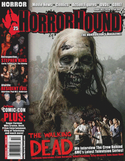
Film Title; The Walking Dead
Release Date; October 31st 2010 Director; Frank Darabont Production/Financing Company; AMC Studios Films Origin/ Info; Based on a comic Book Series Synopsis; The television series is about a group of people trying to survive a zombie apocalypse Sub-Genre; Zombie/ Splatter |
Denotation
A close up is used for the main image of the front cover to signify the deteriorating features of the zombie and thereby project the genre of horror to the potential buyers. Also wide shots are used for the smaller features down the left hand side of the magazine to reflect the large amount of content within the magazine
A close up is used for the main image of the front cover to signify the deteriorating features of the zombie and thereby project the genre of horror to the potential buyers. Also wide shots are used for the smaller features down the left hand side of the magazine to reflect the large amount of content within the magazine
Mise-En-Scene
The lighting for the main image is evenly distributed to project how zombies are often out in the day as well as the night which signifies how they take over large parts of places. The NVC used for the main image is quite simple as the disfigured features of the zombie are self-explanatory thereby the zombie does not need to pose in a way that needs to make them appear dangerous. The colours used for the magazine are mainly dark such as red and black the use of these colours could connote danger, death and terror
The lighting for the main image is evenly distributed to project how zombies are often out in the day as well as the night which signifies how they take over large parts of places. The NVC used for the main image is quite simple as the disfigured features of the zombie are self-explanatory thereby the zombie does not need to pose in a way that needs to make them appear dangerous. The colours used for the magazine are mainly dark such as red and black the use of these colours could connote danger, death and terror
Typography
The title on this film magazine is written in bold, sans serif font and is in red. The colour red connotes blood, death and danger. This may represent or foreshadow what may eventually occur in the film. The use of the colour red is commonly used with the genre horror as it mainly signifies death and blood which are always represented in horror films.
The title on this film magazine is written in bold, sans serif font and is in red. The colour red connotes blood, death and danger. This may represent or foreshadow what may eventually occur in the film. The use of the colour red is commonly used with the genre horror as it mainly signifies death and blood which are always represented in horror films.
Target Audience
The target audience for the film magazine would be adults and teenagers who enjoy the sub-genre zombie and splatter.
The target audience for the film magazine would be adults and teenagers who enjoy the sub-genre zombie and splatter.

|
Film Title; Hell Raiser
Release Date; September 11th 1987 Director; Clive Barker Production/Financing Company; Cinemarque, Entertainment BV & New World Pictures Principle Cast; Claire Higgins, Ashley Laurence & Andrew Robison Films Origin/ Info; A British horror film based upon Clive Barker’s novel The Hellbound Heart. The film also comes from a franchise. Synopsis; Sexual deviant Frank (Sean Chapman) inadvertently opens a portal to hell when he tinkers with a box he bought while abroad. The act unleashes gruesome beings called Cenobites, who tear Frank's body apart. When Frank's brother (Andrew Robinson) and his wife, Julia (Clare Higgins), move into Frank's old house, they accidentally bring what is left of Frank back to life. Frank then convinces Julia, his one-time lover, to lure men back to the house so he can use their blood to reconstruct himself. Sub-Genre; Thriller |
Denotation
A close up shot of the antagonist is represented to emphasize his facial expression and looks. The use of the colour blue is used consistently which may connote a cold person which may represent the antagonist who may be cold and mean.
A close up shot of the antagonist is represented to emphasize his facial expression and looks. The use of the colour blue is used consistently which may connote a cold person which may represent the antagonist who may be cold and mean.
Mise-En-Scene
The antagonist NVC looks sad as his face is facing down and he is not looking at the camera. This could be possible because of the context that the actor has passed. On the side of the magazine has smaller images of other horror films that feature inside the magazine, they also take a similar colour scheme as the main image as well as the masthead. The antagonist has nails poking out his face this sort of represents a mask and connotes a sense of hidden identity.
The antagonist NVC looks sad as his face is facing down and he is not looking at the camera. This could be possible because of the context that the actor has passed. On the side of the magazine has smaller images of other horror films that feature inside the magazine, they also take a similar colour scheme as the main image as well as the masthead. The antagonist has nails poking out his face this sort of represents a mask and connotes a sense of hidden identity.
Typography
The title on this film magazine is written in bold, sans serif font and is in blue and white. The colour white connotes purity which may represent how the main character was in the past.
The title on this film magazine is written in bold, sans serif font and is in blue and white. The colour white connotes purity which may represent how the main character was in the past.
Target Audience
The target audience for this film would be adults who enjoy watching thriller films.
The target audience for this film would be adults who enjoy watching thriller films.
HORROR FILM TRAILER
|
|
Film Title; Paranormal Activity
Release Date; October 16th 2009 Director; Oren Peli Production/Financing Company; Blumhouse Productions & Solana Films Principle Cast; Katie Featherstone & Micah Sloat Films Origin/ Info; Franchise Synopsis; It is the first entry into the Paranormal Activity film series. The film centers on a young couple, Katie and Micah, who are haunted by a supernatural presence in their home. It is presented in the style of "found footage", from cameras set up by the couple in an attempt to document what is haunting them Sub-Genre; Psychological/ Supernatural |
Narrative
The film centres on a young couple Katie and Micah who are haunted by a supernatural presence in their home, They set up cameras in an attempt to find out what is haunting them. The narrative links well the genre choice which is psychological/ supernatural as there's a demonic spirit surrounding their home.
The film centres on a young couple Katie and Micah who are haunted by a supernatural presence in their home, They set up cameras in an attempt to find out what is haunting them. The narrative links well the genre choice which is psychological/ supernatural as there's a demonic spirit surrounding their home.
Mise-En-Scene
The first part of the trailer is set in a cinema where people go to watch paranormal activity this may signify how real the film is especially as in the trailer the audiences reactions to the movie are caught on camera, the audiences facial expressions connote that the film is super scary and terrifying. The second part of the trailer is set in a home in America this is a common characteristic of supernatural/ psychological films as most of the time there is always an evil spirit haunting the house and the main characters. The lighting in the trailer switches from low key to high key lighting consistently this may represent what may eventually occur in the film it may signify uneasiness and trouble. The low key lighting connotes a bad, evil spirit lingering around the main characters home. The props used in this trailer would be the cameras/ video cameras the characters use to capture what may be haunting them.
The first part of the trailer is set in a cinema where people go to watch paranormal activity this may signify how real the film is especially as in the trailer the audiences reactions to the movie are caught on camera, the audiences facial expressions connote that the film is super scary and terrifying. The second part of the trailer is set in a home in America this is a common characteristic of supernatural/ psychological films as most of the time there is always an evil spirit haunting the house and the main characters. The lighting in the trailer switches from low key to high key lighting consistently this may represent what may eventually occur in the film it may signify uneasiness and trouble. The low key lighting connotes a bad, evil spirit lingering around the main characters home. The props used in this trailer would be the cameras/ video cameras the characters use to capture what may be haunting them.
Camera
The trailer begins with an establishing shot of people lining up outside the cinema to go and watch paranormal activity. This then cuts to a mid shot of the protagonists which allows the audience to identify them and familiarise themselves with them. A wide angle shot is then used for the audience to see what supernatural spirit is in the characters room as they are sleeping, you can clearly see a non existent spirit lifting up the covers whilst they sleep. This connotes suspense and makes the trailer climatic, leaving the audience to wonder what's going to happen next.
The trailer begins with an establishing shot of people lining up outside the cinema to go and watch paranormal activity. This then cuts to a mid shot of the protagonists which allows the audience to identify them and familiarise themselves with them. A wide angle shot is then used for the audience to see what supernatural spirit is in the characters room as they are sleeping, you can clearly see a non existent spirit lifting up the covers whilst they sleep. This connotes suspense and makes the trailer climatic, leaving the audience to wonder what's going to happen next.
Sound
At the start of the trailer, a quiet, slow drum sound is played to emphasize the equilibrium of the trailer, which is the audience who are in the cinema watching the movie paranormal activity. The quiet, slow drum sound may connote calmness and nothing unusual happening yet. As the trailer continues non digetic, foley and design sounds are used to recreate things such as the sound of whispering, the sound of screaming and the sound of doors slamming. This represents the disequilibrium as all these sounds connote tension and suspense, and make the trailer even more scarier. Sounds of banging and crashing which are all Foley and design sounds are also used in this trailer. Dialogue inn the film trailer is used when the character Katie says "Something's here, I feel it breathing on me" this signifies that an unwanted, supernatural presence is in their house and is disturbing them. This connotes suspense and tension as it allows the audience to know it may be real which scares them even more.
At the start of the trailer, a quiet, slow drum sound is played to emphasize the equilibrium of the trailer, which is the audience who are in the cinema watching the movie paranormal activity. The quiet, slow drum sound may connote calmness and nothing unusual happening yet. As the trailer continues non digetic, foley and design sounds are used to recreate things such as the sound of whispering, the sound of screaming and the sound of doors slamming. This represents the disequilibrium as all these sounds connote tension and suspense, and make the trailer even more scarier. Sounds of banging and crashing which are all Foley and design sounds are also used in this trailer. Dialogue inn the film trailer is used when the character Katie says "Something's here, I feel it breathing on me" this signifies that an unwanted, supernatural presence is in their house and is disturbing them. This connotes suspense and tension as it allows the audience to know it may be real which scares them even more.
Editing
The trailer used cross cutting to change from different locations such as from the cinema to the actual movie footage of the characters being in their home. Quick cuts where used when highlighting the scariest moments in the film this can attract the audience by making them want to see the full action this may connote suppense and tension and could increase the audience pressure to go and watch the film.
The trailer used cross cutting to change from different locations such as from the cinema to the actual movie footage of the characters being in their home. Quick cuts where used when highlighting the scariest moments in the film this can attract the audience by making them want to see the full action this may connote suppense and tension and could increase the audience pressure to go and watch the film.
Typography
The typography in this film trailer resembles a TV screen signal fuzzing. The mood of the trailer was unsettling and disturbing which represents the unwanted, supernatural substance which is in the characters house.
The typography in this film trailer resembles a TV screen signal fuzzing. The mood of the trailer was unsettling and disturbing which represents the unwanted, supernatural substance which is in the characters house.
Target Audience
The target audience for this film and trailer would be teenagers and adults who enjoy watch supernatural/ psychological films.
The target audience for this film and trailer would be teenagers and adults who enjoy watch supernatural/ psychological films.
|
|
Film Title; The Devil Inside
Release Date; January 6th 2012 Director; William Brent Bell Production/ Financing Company; Insurge Pictures & Prototype Principle Cast; Suzan Crowley, Evan Helmuth, Fernanda Andrade & Simon Quaterman Films Origin/ Info; Synopsis; Twenty years after Maria Rossi (Suzan Crowley) murdered three people, her daughter, Isabella (Fernanda Andrade), seeks the truth about that terrible night. Isabella travels to an Italian hospital for the criminally insane where Maria is locked away to find out whether her mother is mentally ill or demonically possessed. With the help of two young exorcists (Simon Quarterman, Evan Helmuth), Isabella tries to cure Maria engages four demons in a battle for her mother's soul. Sub-Genre; Psychological/ Supernatural |
Narrative
Twenty years after Maria Rossi murdered three people, her daughter, Isabella seeks the truth about that terrible night. Isabella travels to an Italian hospital for the criminally insane where Maria is locked away to find out whether her mother is mentally ill or demonically possessed. With the help of two young exorcists Isabella tries to cure Maria engages four demons in a battle for her mother's soul. This links to the sub-genre of psychological/ supernatural as one of the characters has been possessed by a demon.
Twenty years after Maria Rossi murdered three people, her daughter, Isabella seeks the truth about that terrible night. Isabella travels to an Italian hospital for the criminally insane where Maria is locked away to find out whether her mother is mentally ill or demonically possessed. With the help of two young exorcists Isabella tries to cure Maria engages four demons in a battle for her mother's soul. This links to the sub-genre of psychological/ supernatural as one of the characters has been possessed by a demon.
Mise-En-Scene
The trailer is set in different areas in Rome mainly a psychiatric ward where one of the characters live. Low key and high key lighting is used mainly in this trailer to emphasize the uneasiness of the movie and could signify that something unusual or bad would occur. The use of low key lighting connotes a devil or evil spirit lingering or contaminating the characters. The character Maria is living in a psychiatric ward where she has scars all over her body mainly in the shape of a cross this could connote she may have a devil living inside her and she harms herself in a way to get relief from the pain, the devil living inside her represents the name of the movie.
The trailer is set in different areas in Rome mainly a psychiatric ward where one of the characters live. Low key and high key lighting is used mainly in this trailer to emphasize the uneasiness of the movie and could signify that something unusual or bad would occur. The use of low key lighting connotes a devil or evil spirit lingering or contaminating the characters. The character Maria is living in a psychiatric ward where she has scars all over her body mainly in the shape of a cross this could connote she may have a devil living inside her and she harms herself in a way to get relief from the pain, the devil living inside her represents the name of the movie.
Camera
The trailer begins a panning shot of the character Isabella explaining what her mother has done which was killing 3 people. The camera then cuts to an establishing shot of Rome to allow the audience to know where the movie was set in, so they could familiarise themselves with it. The camera then cuts to a close up shot of the character Maria to emphasize how possessed she looks this connotes tension. Later on in the trailer the camera cuts to a long shot of Maria on a hospital bed where her body is in an unnatural, awkward position, this may signify and allow the audience to actually see that a devil may really be inside her and has actually possessed her. This connotes Suspense and builds up the films climax.
The trailer begins a panning shot of the character Isabella explaining what her mother has done which was killing 3 people. The camera then cuts to an establishing shot of Rome to allow the audience to know where the movie was set in, so they could familiarise themselves with it. The camera then cuts to a close up shot of the character Maria to emphasize how possessed she looks this connotes tension. Later on in the trailer the camera cuts to a long shot of Maria on a hospital bed where her body is in an unnatural, awkward position, this may signify and allow the audience to actually see that a devil may really be inside her and has actually possessed her. This connotes Suspense and builds up the films climax.
Sound
The trailer begins with real footage of Maria admitting to the police during a phone call that she killed 3 people, she states "three people are dead.... I killed them". This connotes suspense and builds up tension gradually as it allows the audience to know that this may be based on a true story especially as they have added In real footage. Non diegetic, Foley and design sound have been used to recreate things such as bones cracking, a woman screaming and singing nursery rhymes. These things all build up the films tension even more. The main character Maria is represented to be speaking in tongues this emphasizes the fact that there really must be something inside her which is taking over her whole body, possessing her.
The trailer begins with real footage of Maria admitting to the police during a phone call that she killed 3 people, she states "three people are dead.... I killed them". This connotes suspense and builds up tension gradually as it allows the audience to know that this may be based on a true story especially as they have added In real footage. Non diegetic, Foley and design sound have been used to recreate things such as bones cracking, a woman screaming and singing nursery rhymes. These things all build up the films tension even more. The main character Maria is represented to be speaking in tongues this emphasizes the fact that there really must be something inside her which is taking over her whole body, possessing her.
Editing
The trailer used cross cutting to change from different locations within Rome to allow the audience to familiarise themselves with the area and settings. Quick cuts where used when highlighting the scariest moments in the film this can attract the audience by making them want to see the full action this may connote suppense and tension and could increase the audience pressure to go and watch the film.
The trailer used cross cutting to change from different locations within Rome to allow the audience to familiarise themselves with the area and settings. Quick cuts where used when highlighting the scariest moments in the film this can attract the audience by making them want to see the full action this may connote suppense and tension and could increase the audience pressure to go and watch the film.
Typography
The use of having "This is the actual 911 call placed from the home of Maria Possi on October 30th 1989" gives the audience an immediate reaction that this may be based on a true story, this adds to the climax of the trailer and connotes suspense and tension. The mood of the trailer was unsettling and disturbing which represents the unwanted, supernatural substance which is living in the characters body.
The use of having "This is the actual 911 call placed from the home of Maria Possi on October 30th 1989" gives the audience an immediate reaction that this may be based on a true story, this adds to the climax of the trailer and connotes suspense and tension. The mood of the trailer was unsettling and disturbing which represents the unwanted, supernatural substance which is living in the characters body.
Target Audience
The target audience for this film and trailer would be teenagers and adults who enjoy watching films with the sub-genre psychological/ supernatural.
The target audience for this film and trailer would be teenagers and adults who enjoy watching films with the sub-genre psychological/ supernatural.
|
|
Film Title; The Conjuring
Release Date; July 19th 2013 Director; James Wan Production/ Financing Company; New Line Cinema, The Safran Company & Evergreen Media Group Principle Cast; Vera Farmiga, Patrick Wilson, Ron Livingston & Lili Taylor Films Origin/ Info; Franchise Synopsis; In 1970, paranormal investigators and demonologists Lorraine (Vera Farmiga) and Ed (Patrick Wilson) Warren are summoned to the home of Carolyn (Lili Taylor) and Roger (Ron Livingston) Perron. The Perrons and their five daughters have recently moved into a secluded farmhouse, where a supernatural presence has made itself known. Though the manifestations are relatively benign at first, events soon escalate in horrifying fashion, especially after the Warrens discover the house's macabre history. Sub-Genre; Psychological/ Supernatural |
Narrative
In 1970, paranormal investigators and demonologists Lorraine and Ed Warren are summoned to the home of Carolyn (Lili Taylor) and Roger Perron. The Perrons and their five daughters have recently moved into a secluded farmhouse, where a supernatural presence has made itself known. Though the manifestations are relatively benign at first, events soon escalate in horrifying fashion, especially after the Warrens discover the house's macabre history. This links well with the sub-genre psychological/ Supernatural as the movie is based on a house which is possessed or has unnatural or supernatural substances or spirits living inside it and haunting it.
In 1970, paranormal investigators and demonologists Lorraine and Ed Warren are summoned to the home of Carolyn (Lili Taylor) and Roger Perron. The Perrons and their five daughters have recently moved into a secluded farmhouse, where a supernatural presence has made itself known. Though the manifestations are relatively benign at first, events soon escalate in horrifying fashion, especially after the Warrens discover the house's macabre history. This links well with the sub-genre psychological/ Supernatural as the movie is based on a house which is possessed or has unnatural or supernatural substances or spirits living inside it and haunting it.
Mise-En-Scene
The trailer is set in secluded farmhouse/ house where the characters have just moved into their new home. This is a common characteristic of psychological/supernatural films as they always have a house which has a demonic spirit living inside in disturbing and haunting the characters. Low key lighting is used mainly in the trailer to connote an unwanted spirit that may be lingering around the characters and their house. This adds to the suspense of the trailer as it makes the audience want to find out more about this supernatural spirit. The characters costumes are all 1970's clothing which emphasize the fact that the movie is based in the 1970's.
The trailer is set in secluded farmhouse/ house where the characters have just moved into their new home. This is a common characteristic of psychological/supernatural films as they always have a house which has a demonic spirit living inside in disturbing and haunting the characters. Low key lighting is used mainly in the trailer to connote an unwanted spirit that may be lingering around the characters and their house. This adds to the suspense of the trailer as it makes the audience want to find out more about this supernatural spirit. The characters costumes are all 1970's clothing which emphasize the fact that the movie is based in the 1970's.
Camera
The trailer begins with a wide angle shot of the characters opening the door of their new home, this give the audience an idea of who are the protagonists in the film and it gives them an idea of how their house looks like. An establishing shot is used later on in the trailer when the mum is playing clap and go seek with her daughters and she is trying to find them however instead of hearing her daughters clap she hears an unwanted, supernatural presence clap. This connotes suspense and tension and makes the audience want to actually see the film to know what would happen. This adds the climax of the film.
The trailer begins with a wide angle shot of the characters opening the door of their new home, this give the audience an idea of who are the protagonists in the film and it gives them an idea of how their house looks like. An establishing shot is used later on in the trailer when the mum is playing clap and go seek with her daughters and she is trying to find them however instead of hearing her daughters clap she hears an unwanted, supernatural presence clap. This connotes suspense and tension and makes the audience want to actually see the film to know what would happen. This adds the climax of the film.
Sound
The trailer begins with upbeat 70's pop music to represent the equilibrium the characters are experiencing which is the excitement of moving into a new home. This comes to an abrupt stop when the disequilibrium occurs and Foley, design and non-diegetic sounds are used for things such as crashing sounds, a little girl laughing, the sound of clapping, the sound of a door creeping open, glass breaking and the sound of a toy box. All these sound add to the film trailers climax and connote suspense and tension. It gives the audience an idea that there really must be an unwanted supernatural spirit in their house, this would encourage the audience to go and watch the film as they would want to know what happens next.
The trailer begins with upbeat 70's pop music to represent the equilibrium the characters are experiencing which is the excitement of moving into a new home. This comes to an abrupt stop when the disequilibrium occurs and Foley, design and non-diegetic sounds are used for things such as crashing sounds, a little girl laughing, the sound of clapping, the sound of a door creeping open, glass breaking and the sound of a toy box. All these sound add to the film trailers climax and connote suspense and tension. It gives the audience an idea that there really must be an unwanted supernatural spirit in their house, this would encourage the audience to go and watch the film as they would want to know what happens next.
Editing
The trailer used cross-cutting to change from different locations within the house, to allow the audience to familiarise themselves with it. Quick cuts where used when highlighting the scariest moments in the film this can attract the audience by making them want to see the full action this may connote suppense and tension and could increase the audience pressure to go and watch the film.
The trailer used cross-cutting to change from different locations within the house, to allow the audience to familiarise themselves with it. Quick cuts where used when highlighting the scariest moments in the film this can attract the audience by making them want to see the full action this may connote suppense and tension and could increase the audience pressure to go and watch the film.
Typography
The mood of the trailer was unsettling and disturbing which represents the unwanted, supernatural substance which is in the characters house. The use of having 'from the directors of paranormal activity and saw' films that have been proven to be quite successful, gives The conjuring an immediate reputation for audience to actually watch the film especially as it states based on a true story, the audience would want to know hat happens next. This adds to the climax of the film which may connote suspense.
The mood of the trailer was unsettling and disturbing which represents the unwanted, supernatural substance which is in the characters house. The use of having 'from the directors of paranormal activity and saw' films that have been proven to be quite successful, gives The conjuring an immediate reputation for audience to actually watch the film especially as it states based on a true story, the audience would want to know hat happens next. This adds to the climax of the film which may connote suspense.
Target Audience
The target audience for this film and trailer would be teenagers and adults who enjoy movies with the sub-genre psychological/ supernatural.
The target audience for this film and trailer would be teenagers and adults who enjoy movies with the sub-genre psychological/ supernatural.
